

Sunsets are red and so are tomatoes, yet these two reds are quite different. The word "red" by itself doesn't carry enough information to uniquely identify a particular sensation of color. So we use terms like rose red, fire truck red, pistachio green, sky blue etc. to communicate color with more accuracy. Still, this qualitative approach to describing color doesn't begin to cover all the millions of colors that we can see. Is there a way to assign a number to each color so that if two numbers are close together then their corresponding color sensations would also be close together? By analogy, if we were measuring the sensation of brightness and assigned the value 100 to a particular brightness, then 99 would be less bright and 101 would be brighter. Can this be done with red so that, say, a 100 red is redder than a 99 red and less red than a 101 red?
Let's think about this. A color "less red" than a tomato could mean a pinkish red like bubble gum, but it could also mean a darker, bluish red, like cherry. So bubble gum and cherry are "less red" in different ways. "Less" in the case of red doesn't mean the same thing as "less" as in 99 is less than 100. Does this mean that color doesn't lend itself to quantitative measurement? Not at all. It just means we need more than one number to quantify color. In fact three numbers are needed. Just as we need three numbers to quantify a room--length, width, and height -- we need three numbers to quantify color, one for each dimension of color. The colors that we see can be thought to exist in a three dimensional "color space."
Sometimes these three color dimensions are expressed in Red, Green, Blue (RGB) format. For example a set of three numbers like (100, 0, 30) instructs your computer monitor to turn on 100 units of red light, zero units of green light and 30 units of blue light at a particular spot on the screen. The specific basic colors of red, green and blue light depend on the individual manufacturer and model.
A more intuitive way of imagining the color space is via the Hue, Saturation, Luminosity (HSL) format See figure 1. "Hue" is our intuitive sense of the color of an object--reddish, greenish, bluish, yellowish. "Saturation" (sometimes called chroma) is our intuitive sense of the purity of a color, its "colorfulness." Tomatoes and bubble gum both have a reddish hue but tomato has a more saturated red than bubble gum. "Luminosity" is our intuitive sense of brightness. Despite our assumption about a three dimensional color space, "luminosity" and "saturation" aren't entirely independent dimensions; if you were to make a painting of a cluster of tomatoes partly in the shade and partly in the light, you would of course find that you would need to use a less colorful palette (more black mixed in) for the shaded tomatoes. But for now we will use the approximate but reasonable idea that saturation and luminosity are independent dimensions like length and width.
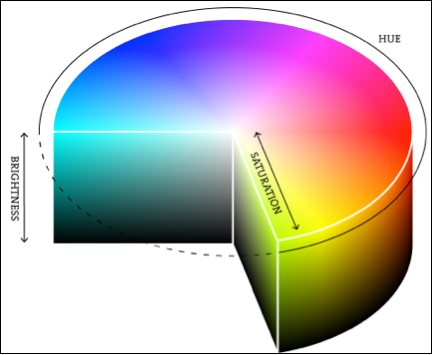
Figure 1. The colors that we see can be thought to exist in a three dimensional
"color space." There are many schemes for representing color in three dimensions.
The Hue, Saturation, Luminance (brightness) is a common scheme.
Source:
http://www.processing.org/tutorials/color/imgs/hsb.png
To illustrate the HSL scheme, figure 2 shows a color circle, which is a cross section of the cylinder in three dimensional color space of figure 1. This circle is organized so that the reddest hue appears at 0 degrees, and as the angle increases the hue changes to orange, yellow, green, blue, purple, and finally back to red. So an angle can be assigned to each hue.
If we take the same angle, say 15 degrees, and move radially inwards towards the center of the circle, the hue value stays the same but the color becomes less saturated--less "pure." So the 15 degree red around the edge of the circle gets more and more pinkish as we move to the center of the circle along the same hue angle. Notice that all hues in this cross section of the cylinder converge to grey at the center (colorless). Cross sections lower in the cylinder have progressively darker colors and darker grey centers until all goes to black.
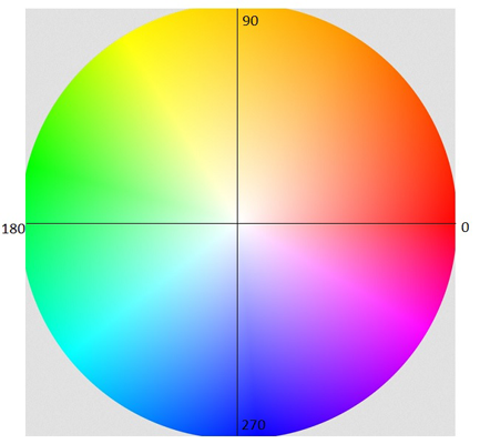
Figure 2. A color circle. The hue of a color is measured as an angle around
the circle,with red being at zero degrees, orange-yellow at 90 degrees,
green at 180 degreesand blue at 270 degrees. The saturation of a
color is measured radially from the center. Less saturated colors
of the same hue are closer to the center. Grey has the lowest saturation.
Source:
https://kuler.adobe.com/build2.0.0-buildNo/resource/img/kuler/color_wheel_730.png
Figure 3 shows the hue values of the color circle in figure 2. Darker parts of figure 3 represent low angles (reddish) and brighter parts represent higher angles (toward blue).
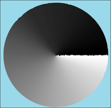
Figure 3. Hue values of figure 1. Source: CCDMETRIX
Figure 4 shows the saturation values of the color circle in figure 2. Darker parts of the image represent low saturation and brighter parts represent higher saturation values (more color).
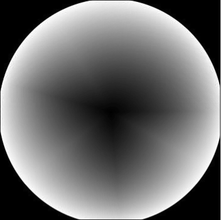
Figure 4. Saturation values of figure 2. Source: CCDMETRIX
As for the luminosity (brightness) dimension of figure 2, we could measure the distribution of light power being emitted from figure 2, and it would look the same as if we took a black and white picture of the figure, as in figure 5 below. Surprisingly, this not an accurate way to measure how we perceive brightness.

Figure 5 intensity (light power) values of figure 1. Source: CCDMETRIX
When it comes to human sensation and perception few phenomenon are straightforward and modifications are needed. For example, our eyes happen to be more sensitive to green-yellow light than to blue light. A certain amount of light power in green-yellow appears brighter to us than the same amount of power in blue. If we were to remap the figure 5 intensity map to account for color dependent differences in brightness perception, we would not get such a smoothly symmetric picture as in figure 5. Instead we would get something like figure 6. This is the Luminance or brightness number.
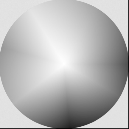
Figure 6. Intensity values of figure 2 adjusted for color dependent differences
in human brightness perception. Compare with figure 5. These values are
called "luminance" to distinguish them from "intensity" values of figure 4
which represents a simple power output distribution of the light. Source: CCDMETRIX
The color circle is a good conceptual beginning for understanding color spaces. Colors with single wavelengths--unmixed with other wavelengths, such as the colors in the rainbow or light emitted by lasers--reside on the edge of the circle, because these colors are as pure (saturated) as can be. As the color wavelengths mix in different proportions, they can be represented by different points inside the color space volume.
So far we have been discussing the idea of color space without mentioning an important property that a space must have, namely a measure called the "distance" between two points. This is certainly true for real three dimensional space, but is there such a measure as the distance between two colors? If so, how far is tomato red from bubble gum? This question has an answer that we will leave for a future article.

Ari Siletz is president of CCDMETRIX. His company specializes in automated vision system inspection and metrology. With a background in both optical and software engineering, Ari has been developing instruments for the the ophthalmic and optical coating industries since the 1980s. Writing is one of Ari's serious hobbies. He is a published author whose short stories have appeared in numerous literary anthologies. He lives in Sebastopol, California.