
Photograph by Ned Matura
By Barry Santini
Color is Complex
Although a general overview of color enhancement science is the goal of this article, the subject of color, our perception of it and its manifold interaction with our total health is far larger and beyond the scope of this short primer. Yet there are some aspects of color vision that, while complex, are important to understand.
THE BASIC VOCABULARY OF COLOR DEFICIENCY
Normal human color vision, where the three cones present are functioning normally, is referred to as trichromacy. When only two cones are present, it is referred to as dichromacy. Where only one cone, or only rods are functioning, it is called monochromacy. When the three cones are present, but a color vision deficiency is noted, it is termed anomalous trichromacy.
Broadly, anomalous trichromacy is defined as when one or more color receptors exhibit a shift in spectral sensitivity, relating to wavelength, intensity or both, and results in a departure from normal tristimulus values. Below is a list of three different types of color deficiencies related to anomalous trichromacy:
Protonomaly—A shift in the spectral sensitivity of the L, or red receptor.
It is genetically and sex linked, affecting 1 percent of males.
Deuternomaly—A shift in the spectral sensitivity of the M, or green
receptor. It is the most common type of color deficiency and is also
genetically and sex linked, but affects 5 percent of males.
Tritanomaly—A shift in the spectral sensitivity of the S, or blue receptor, affecting blue-green discrimination. It is rare and is hereditary but not sex linked.
Color blindness—Defined as having one or more receptors absent or having significantly impaired function—along with color deficiency, together affect approximately 8 percent of males and less than 0.5 percent of females. The differences between color deficiency and blindness are not completely distinct, and amount to differences in perception based on degree.
PHYSICS AND PERCEPTION OF COLOR
When discussing the pure physics of color, we first distinguish between the spectrum—or wavelengths and their intensities—emitted by a light source called the illuminant, and the spectrum of light reflected from the surface of an object. The color we see is the net spectrum reflected from its surface, comprised of the interaction between the illuminant’s spectrum and the inherent textural and reflective properties of the object’s surface.
METAMERISM
Because the tristimulus value of our eye’s receptors cover a wide range of frequencies which can overlap each other, it is possible for light from two different sources to provoke the same tristimulus response in the cone receptors, yet have very different spectral profiles. And where the tristimulus responses are the same, our perception of these colors is the same too. Different light spectra, whether illuminant or reflective, that produce identical tristimulus responses are said to be metamers of each other. This is why we cannot fully understand the spectral composition
of a tint using your naked eye alone.
COLOR CONSTANCY
The actual spectral color profile of an object can change during differing levels of illumination, changes in viewing angle and the spectral nature of the illuminant involved. In addition, the color of nearby objects and the adjoining space will influence the color our eyes perceive. The human
visual system, or HVS, has evolved a mechanism called color constancy to help our visual processing from reaching an incorrect conclusion about
an object’s color in different contextual situations. You can see color constancy in action when sampling a change in sunglass color where, after only a little acclimation time, color relationships appear to normalize.
TIMING IS EVERYTHING
In the lateral geniculate nucleus (LGN), the brain shares information between different senses and systems. For example, when you hear a loud sound, your auditory sense alerts and localizes you to where the sound is coming from, and communicates this to both your vision and proprioception. From this sharing, your head and eyes “instinctively” know where to turn or look. As these signals are processed and shared, timing or phase issues can occur, resulting in mismatches or unintended crosstalk between different senses. Synesthesia, where individuals hear sounds that produce associated color or taste sensations, is one example of abnormal sensory sharing. Dyslexia, a broadly termed reading disorder, is thought to originate in part from timing discrepancies in vision signals between the eyes. Dyslexic symptoms, such as letters jumping, shaking and moving, as well as asthenopic symptoms of nausea, headache and fatigue, are thought to be related to these mistimed signals, which cause a rivalry rather than a synergy between the eyes for the brain’s attention. ChromaGen is a company that specializes in the diagnosis and application of special filters designed to re-establish balanced timing between the eyes’ signals to the brain. Their lens technology has received U.S. FDA 510(k) clearance.
COLOR AND AUTISTIC SPECTRUM DISORDERS
The range of problems encountered in autistic children is broad. Many problems, however, either have or are related to a vision processing component. The range of autistic spectrum disorders can include the following vision processing-related symptoms:
• Decreased facial recognition or face blindness.
• Synesthesia.
• Auditory problems and learning problems (mistimings between lip reading and hearing).
• Dyslexic symptoms.
• Visual field and spatial location defects, resulting in clumsiness, motor coordination problems and even an apparent reckless with respect to bodily harm.
• Eye turn and amblyopia.
Ian Jordan, a UK-based optician who specializes in the use of specially tinted lenses says such lenses can produce results often better and quicker than standard optical interventions. Jordan calls attention to the fact that most of the above problems are related to vision processing, which occurs after the tristimulus values are sent down the optic nerve. He points out that acuity resides mostly in the retina, and children with ASD may demonstrate good acuity but still have significant visual problems. The expert use of band and notch filter lenses can alter vision processing, signal timing and spatial perception, and have shown immediate improvements for many symptoms of ASD.
—BS
THE IMPORTANCE OF COLOR
Given that early humans dressed themselves in the muted tones of animal skins and forest materials for tens of thousands of years, the discovery of natural pigments, like okra and lapis lazuli, must have been both quite surprising and exciting. Fast-forward to the second millennium, where artists were beginning to develop an understanding and appreciation for how to use color.
It wasn’t until the Industrial Revolution though, that the need for ascertaining whether any single individual saw color “like we do” became a priority. In the 1850s, James Maxwell formulated the first glasses designed to help the color impaired. With the growth of railroads and textile mills, the need for uniform recognition of color in track signals and between different types of threads began to rise in importance.
The arrival of automobiles and airplanes—which led to the development of traffic lights—the increased use of colored-wires in the electrification of cities, telephone and computer networks, and even the rise of leisure pursuits like pleasure boating made it necessary to test individuals for normal color vision. Certainly, in almost any medical discipline today, it’s not hard to imagine how the diagnostic and treatment skills of a health care professional could be severely compromised by the inability to correctly recognize the overall pallor or change in a patient’s skin color. Even the simple act of finding a vein to draw blood can become a traumatic event for both patient and medical technician if the technician is color deficient.
Beyond the importance of color in job safety or work efficacy, it is thought that human color vision evolved to help quickly evaluate the mood and health of another individual, which are important requisites for an advanced species’ survival. But before we delve into the science of how we see color, let’s review the extent that color permeates our everyday lives.
THE JOY OF COLOR
Everyone has their favorite color. But color is more than a simple preference. From the hue of the car we drive, to the tone of our cell phone case, to the close attachment we form to a particular favorite, people see color as a personal expression of who they are, how they see the world and most importantly, how they want the world to see them. Color is innately personal, peculiarly cultural and manifestly associated with our moods.
COLOR IS PERSONAL
Clearly, the tone of our skin and the color of our eyes are very important personal identifiers and descriptors of who we are. Change your hair color, and you change how the world sees you, because color has become an important and defining aspect of any society. In view of this, it is interesting to note that big business has only recently begun to exploit our personal relationship to color. Less than 20 years ago, Apple introduced their revolutionary new computer, the iMac, in a color called Bondi Blue, which forever freed electronic devices from the prison of muted gray, black and taupe tones. Within a year, Apple increased the iMac’s color selection by five more hues. Soon a buyer could make a personal selection from a range of up to 11 colors. Today, as Apple introduces the Apple Watch, the company is again leveraging people’s love of color, stoking buyer anticipation with the lure of choosing your favorite color.
COLOR IS CULTURAL
The choice of one’s political, recreational or social affiliation almost always comes with a specific color association that often has cultural or geographic origins. For example, countries have strong national color associations, with Russia represented by red, Israel by blue and white, and the U.S. by red, white and blue. While humans as a species have evolved a clear sensory reaction to the color red, there’s no escaping the fact that there are quite specific psychological and emotional responses to the same color within different cultures. In the West, we use black as the color of mourning, while Ethiopians use white and Iranians use blue for the same context. Yet despite culturally-bred differences, some color associations transcend culture. Those associations occur in the realm of human mood.
MOOD AND COLOR
Certain colors are commonly associated with certain human moods. Yellow is the color of happy, as in sunshine, while blue often means sadness. Mark Changizi, PhD, a neuro-cognitive scientist, has formulated a theory that human color vision primarily evolved to help us sense mood and health by becoming exquisitely tuned to recognizing the amount of blood concentration and blood oxygenation under our skin. As skin is essentially a translucent medium, humans learned to recognize how greater blood concentration gave faces a red flush, possibly indicating anger, while less oxygenated blood would cast a blue-purple tone, indicating poor circulation or poor health. It’s no coincidence that depressed or sad people are said to be feeling “blue.”
But color can also have multiple personalities. Green can mean readiness or envy. Red can indicate love, anger or deceitfulness. Blue can mean serenity, sadness or strength. Considering color’s clear importance in all types of personal and societal interaction, being able to avoid ambiguity surrounding the reading of moods makes a strong case for the importance of screening children for deficiencies in color vision. Certainly life today is complicated enough without starting out handicapped in sensing people’s moods because of poor color discrimination.
COLOR VISION BASICS
The human eye has two types of receptors, the rods and cones, the responses from which are used to determine color in the visible light spectrum from 400 nm to 700 nm:
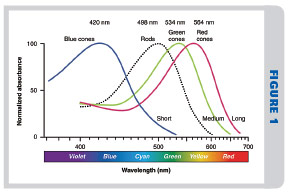
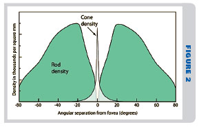
Rods—The eye contains approximately 100 million rod cells, the majority of which are located in the peripheral retina, although some are also found within the outer areas of the macula. Rod cells are about 100 times more light responsive than the cones, capable of firing off a signal when stimulated by a single photon of light. In addition, the response of multiple rod cells is collected and aggregated into a single interneuon, further amplifying their low light detection ability. In Fig. 1, you can see that rods have an asymmetrical response curve, ranging from 400 nm to 600 nm, featuring a peak response sensitivity centered around 498 nm. While the rods are very light sensitive, their reaction time is slower than the cones, taking about 100 milliseconds to fire off a signal in response to a stimulus change.
Cones—The eye’s 6 to 7 million cones are mainly populated in an area called the macula, approximately 6 mm wide, corresponding to a visual field angle of approximately 15 to 18 degrees (30 to 36 full moons wide). But the majority of the cones are actually found in a smaller, exclusively rod-free area called the fovea, or fovea centralis. This area measures 1 mm to 1.5 mm wide and corresponds to a visual field angle of approximately 3 degrees (6 full moons wide). Within the fovea, there is a region 0.35 mm wide, even more densely packed with cones called the foveola, subtending a 0.5 degree visual field angle (1 full moon wide). Here, where the sharpest human vision resides, the density of the retinal mosaic is said to theoretically allow a potential visual acuity of 20/08. Even though the cones allow us to see color and provide our sharpest vision, they are less sensitive to light than the rods, requiring between 10 times and 100 times more photons of light before they will fire. Yet their response time is 4 to 8 times faster than the rods.
 THE COLORED EYE
If nature’s goal was to design the ideal eye for determining color, she would have placed a color receptor, with a sensitivity limited to 1 nm, at each individual wavelength of visible light from 400 nm to 700 nm. Unfortunately, the complexity of wiring 300 individual color receptors is not compliant with the economical dictates of evolution. Instead, nature gave us just three receptors, each of whose frequency response is both broad and overlapped enough to span all of the spectrum of visible light. These are called S, M and L receptors, colloquially corresponding to the short, middle and long wavelengths respectively, of blue, green and red. Depending upon its unique photopigment, or opsin, a receptor will fire in response to varying intensity thresholds across its covered range of wavelengths. Within each color receptor’s frequency range, the aggregated threshold intensities that prompt it to fire determine its tristimulus value.
Color signals are then fired off along the optic nerve, where they encounter a sharing substation called lateral geniculate nucleus, or LGN. In the LGN, vision signals are coordinated between other sensory processes, including smell and hearing. Beyond the LGN, selected nerve fibers then criss-cross within the optic chasm before finally terminating in the occipital lobe of the brain. The actual color we perceive is the net result of complex visual processing calculations comparing the responses between the different receptors. The sum of these calculations, averaged across the visible light spectrum, is a wavelength versus intensity contour plot that identifies the eye’s overall tristimulus curve. The inclusive range of colors that can actually be discriminated is called the gamut and is defined by the response of these three receptors. A mathematically-based model of this gamut that correlates the perceptual relationship for a color’s hue, saturation and brightness is referred to as the eye’s color space. Interestingly, despite only having three color receptors, it is theorized that our eye can discern over 7 million different colors.
Defining Color
Visible colors are defined by the wavelength of their light. Here’s a quick table of colors and their approximate wavelength values, from short to long: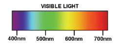
| Violet | 400-440 nm |
| Blue | 455-492 nm |
| Green | 500-560 nm |
| Yellow | 570-589 nm |
| Orange | 590-622 nm |
| Red | 622-700 nm |
The approximate covered range of color wavelengths and their peak sensitivities is listed below for each of the eye’s light receptors:
| Rods | 400 nm-600 nm | 498 nm (scotopic/low intensities only) | |
| Blue cone | (S) | 400 nm-510 nm | 425 nm |
| Green cone | (M) | 430 nm-630 nm | 535 nm |
| Red cone | (L) | 450 nm-700 nm | 565 nm |
IMPORTANT COLOR MILE MARKERS
| Range of greatest retinal cell impact | 415 nm-455 nm |
| High-Energy Visible Light | 400 nm-500 nm |
| Circadian rhythm phase shift | 460 nm |
| Pupillary Reflex, Pituitary growth stimulus | 475 nm-495 nm |
| Overall peak photonic sensitivity of eye | 555 nm |
| ISO/European diopter reference wavelength | 546 nm |
| Sharpness sensitivity wavelength | 572 nm |
| USA diopter reference wavelength | 587 nm |
| Autorefractor reference wavelength | 843 nm (infrared) |
—BS
IN THE EYE OF THE BEHOLDER
For us to see colors as accurately as possible, three basic processes must work normally:
• The receptor’s tristimulus response.
• The timing of the receptor signals through the optic nerve and in the LGN.
• The processing of nerve signals both in the LGN and the occipital lobe of the brain.
When an anomaly in color perception is presented, it is broadly termed a color deficiency. If the deficiency is severe enough, a diagnosis of color blindness may be applied. With three color receptors, there are a number of possibilities from which color vision deficiencies can originate.
The most common deficiency is an alteration of the light frequencies covered by an individual photopigment’s response. For example, in Fig. 1, note how closely the L and M—or red and green—receptors overlap. This overlap can be impacted by:
• A shift frequency range to which a receptor responds.
• A shift in the threshold intensities of a receptor’s wavelength response, which may include a loss of most or all of a receptor’s functional response.
In either case, the net result is departure from the eye’s normal tristimulus response. The nature and degree to which this response is impacted has a well-defined vocabulary (see sidebar, “Color is Complicated”). These departures from normal response create miscalculations in visual processing in the LGN and the brain, which alters our color perception. Reduced or incorrect color discrimination—aka chromatic contrast—is the result, and an overall diagnosis of color deficiency is applied.
CORRECTING COLOR DEFICIENCY
In order to properly address a color deficiency, one must first analyze precisely what is affecting color perception within the visual chain. To do this, tests have been created that identify and quantify where the problems may lie. The most commonly used test for color vision today is the Ishihara color plate test, which is designed to primarily identify the response of L and M cones. Problems here manifest themselves as a red-green color deficiency, the most common form of color vision anomaly. Other color vision tests include the Farnsworth Lantern test and Farnsworth Munsell 100 Hue test. This last test uses the threshold of “just noticeable differences” to help screen people in jobs requiring critical color discrimination skills, such as film colorists and visual artists.
Once the diagnosis of the deficiency is known, the process begins to find and apply the proper spectral control filter to correct or reduce the deficiency. But discovering the best and most efficacious filter can require extensive and sophisticated tests, including those designed to create a custom map of an individual’s color space. This process is somewhat analogous to hearing tests used in tuning the response of a hearing aid. Although improvements can be found serendipitously through trial and error use of broad spectrum tints and overlays, if there are signs that point to a larger disorder, such as autism spectrum disorder, or ASD, only the skills and experience of a specialist will do.
TWEAKING THE TRISTIMULUS
When the response of one or more color receptors departs from normal, the calculations carried out in the LGN and the brain become corrupted, resulting in the incorrect recognition or discrimination of colors. The solution, in the broadest terms, is simple: Apply a filter designed to help bring the tristimulus responses closer to normal. In common red-green color deficiency, for example, where the overlap of the L and M cones response is often reduced, a properly designed notch or band filter, having a suppressive action in the overlapped area, can help better separate the signals passed to the LGN and brain. Any alteration of the tristimulus responses that helps it to more closely mimic normal will result in improvement color identification and discrimination. But because color vision deficiencies can differ in origin, interaction and degree, optimal correction may require the expertise of a trained eyecare professional.
CREATING COLOR ENHANCEMENT
The same tweaking of the tristimulus curve is found in the various sunglass technologies that promise a color enhancing experience. It should be obvious that even for a normal eye, a properly designed and tailored spectral control filter can improve chromatic contrast and enhance the experience of color. Further, enhancement can even be tailored for specific activities in differing spectral environments, such as boating versus golf, or simply to provide an overall enhancement of color, regardless of the intended activity.
Our eyes have general difficulty with blue light, both in focusing and from its increased tendency to scatter. Regardless of base lens color, enhancement generally begins with some attenuation of the blue-violet region ranging from 400 nm to 500 nm. These wavelengths of high-energy visible light, or HEVL, are known to penetrate the macula pigment and are considered prime suspects in creating the damage seen in age-related macula degeneration, or AMD. Note that blue light around 460 nm influences our daily circadian rhythms and is associated with seasonal affected disorder.
Most color enhancement technologies try to enhance color perception by influencing the tristimulus values of the L and M receptors by altering the region between 570 nm and 580 nm, where their responses overlap. This approach also follows that used in addressing red-green color deficiency. As the eye is most sensitive to light in this yellow wavelength region, an accompanying improvement in overall light sensitivity is generally noted. At the far end of the visible red spectrum is the infrared, aka heat radiation, and further attenuation here helps enhance comfort by reducing tear evaporation.
Some color enhancement technologies have their origins in research targeting occupational benefits. The company O2Amp, co-founded by Dr. Mark Changizi, has targeted technology that amplifies the signal our red-green receptors evolved to detect in the first place, namely oxygenation variations in the blood under the skin. His color-enhancing lenses use special filters designed to help health care professionals better identify changes in skin color, thereby improving both normal and palliative care. Another company, EnChroma, has developed color corrective and re-timing technologies that originated with designing lenses to protect surgeons using lasers.
Blue... With Benefits
Over 100 years ago, while investigating how lens tints could help block infrared radiation and help prevent cataracts, William Crookes discovered that blue-colored lenses made reading easier for many people. His Crookes A & B lenses subsequently became a common stock item in the lens distributors of the day.
Today, researchers are investigating ways that blue light may help to reduce the headaches and fatigue that can plague intensive users of computer and mobile device displays, particularly college students and those in technology occupations. Dr. Christopher Chase of the Western University of Health Sciences, posits that people who have asthenopic reading problems may find relief by using a blue background field or blue-tinted lenses. Particularly individuals with symptoms of poor accommodative reserve or accommodative lag, or who have an overabundance of L (red) receptors—resulting in an imbalance in the ratio of L versus M (green) cones—have found blue-shaded lenses helpful in reducing fatigue and headache.
Pointing out that the visible spectrum actually spans a dioptric interval of 2 to 2.5 diopters in the eye, Dr. Chase theorizes that the additional accommodative demand experienced by people with this type of L/M cone imbalance results from a shift in the eye’s focus sensitivity from the normal 572 nm toward the red end of the spectrum. His conclusion: Blue tinted lenses may help to offset this shift and reduce accommodative demand.
—BS
Broad spectrum tints, defined as a transmission contour free of the excessive peaks and troughs characteristic of specialized notch and band filters, remain the most broadly used to provide a targeted enhancement of color for different lifestyle activities. For example, in activities where contrast enhancement is desired, such as hunting, golf and tennis, tints like brown, orange/vermillion and rose are used to selectively block the blue end of the spectrum, reducing haze and scatter.
CHANGING UP COLOR
Making a change in the color of sunglasses comes with a little appreciated, hidden benefit: Your brain begins to pay more attention to everything around you. Because all of our senses have evolved to be acutely sensitive to any change in habitual stimulus, switching your sunglass color changes the tristimulus response your brain is used to, and through the LGN, puts vision, along with other senses, on higher alert, ready to pay more attention to everything going on. This “changing up” is part of the reason why different lens companies offer lenses of different lens colors, but all of which promise improved performance for the same targeted activity.
PPG, a company with a long history of optical lens innovations, such as the development of CR-39 monomer and the technology behind Transitions photo-adaptive lenses, has developed a broad spectrum lens tint recommendation chart for different sports activities. This chart can be found at transitions.pro.com.
YOU CAN’T JUDGE A BOOK...
… Nor a tint by its color. It’s attractive to think that the color-enhancing benefits found with one color lens can be duplicated by using a similar colored lens to deliver the same benefit. Unfortunately, the nature of our tristimulus response and the effect of metamerism make duplicating by eye the benefits of specialized, color corrective and enhancing narrow band/notch filters a futile endeavor.
The desire to fully experience and be influenced by a vibrant, color-filled world has evolved to become an innate part of our human nature. Each and every eyecare professional should place looking into the latest technologies at the top of their “to do” list, because today, there is much more behind the science of color enhancement than meets the eye. ■
L&T contributing editor Barry Santini is a New York State-licensed optician based in Seaford, N.Y. He thanks Dr. Mark Changizi, Andy Schmeder and Ian Jordan for their help with this article.